
Caspeco
A Low-Fidelity UX Exploration
Caspeco Mina Sidor is an app used by hospitality employees to check shifts, mark availability, and search for extra work. In a fast-paced environment like restaurants or hotels, employees need to access this information quickly and confidently. Yet the current app makes something as simple as “marking your availability” surprisingly confusing.

Below is the documentation of the project, and you can also check out the Figma file by
The Problem
Imagine this: You’re on the floor at a busy restaurant. You remember you need to mark a day off next week. You open the app… and are greeted by a row of cryptic icons. Which one is Availability? Which one lets you search for shifts? You click one… nothing happens. Click another… a generic error pops up:
“Something went wrong – request failed with status code 500.”
Now you’re unsure: Did it save? Did it fail? Do you have to try again?
This is exactly the challenge employees face:
Icons without labels make navigation unclear and stressful
All icons have equal weight, hiding which actions are important
Feedback for availability updates is vague or missing
Mistakes can have real consequences in scheduling
In short, the app is functional—but confusing at exactly the moment users need clarity the most.

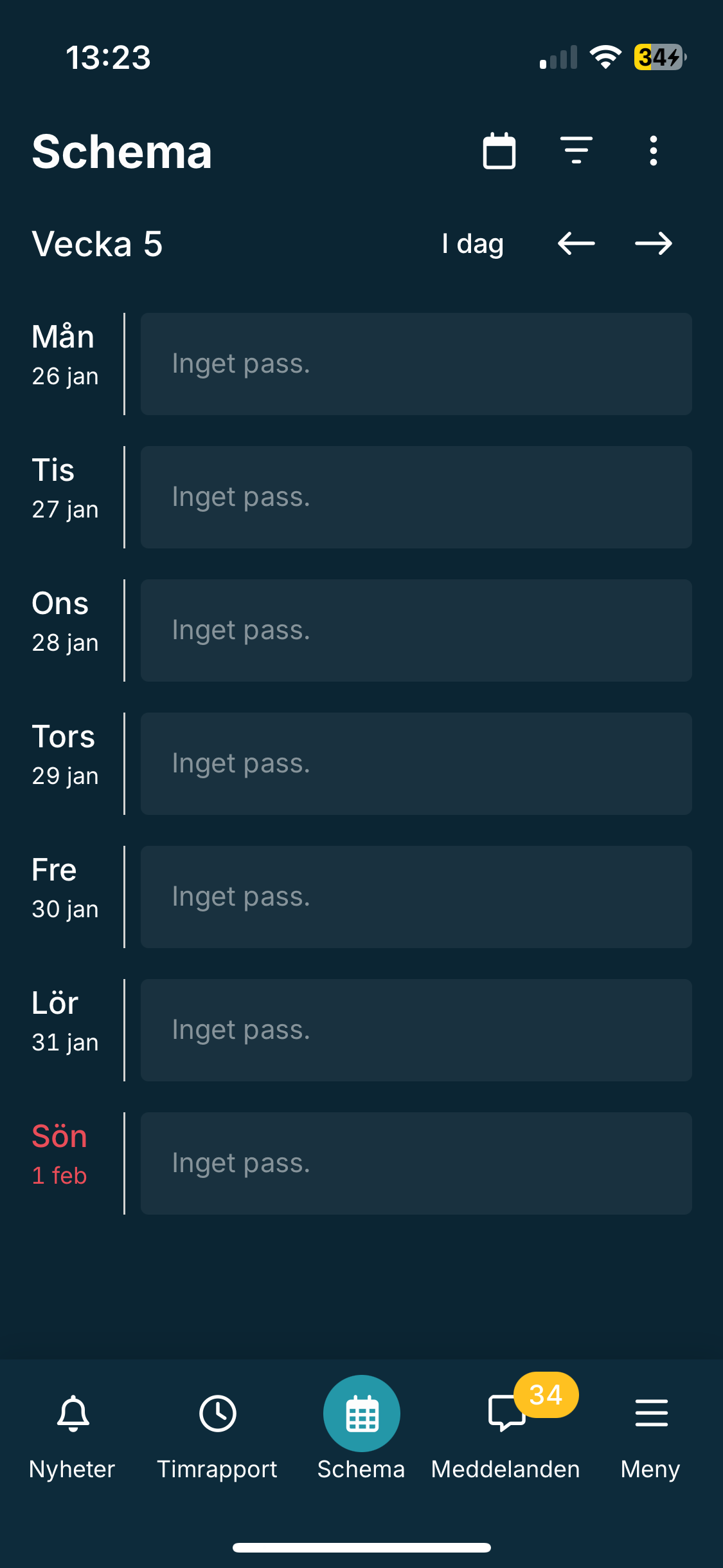
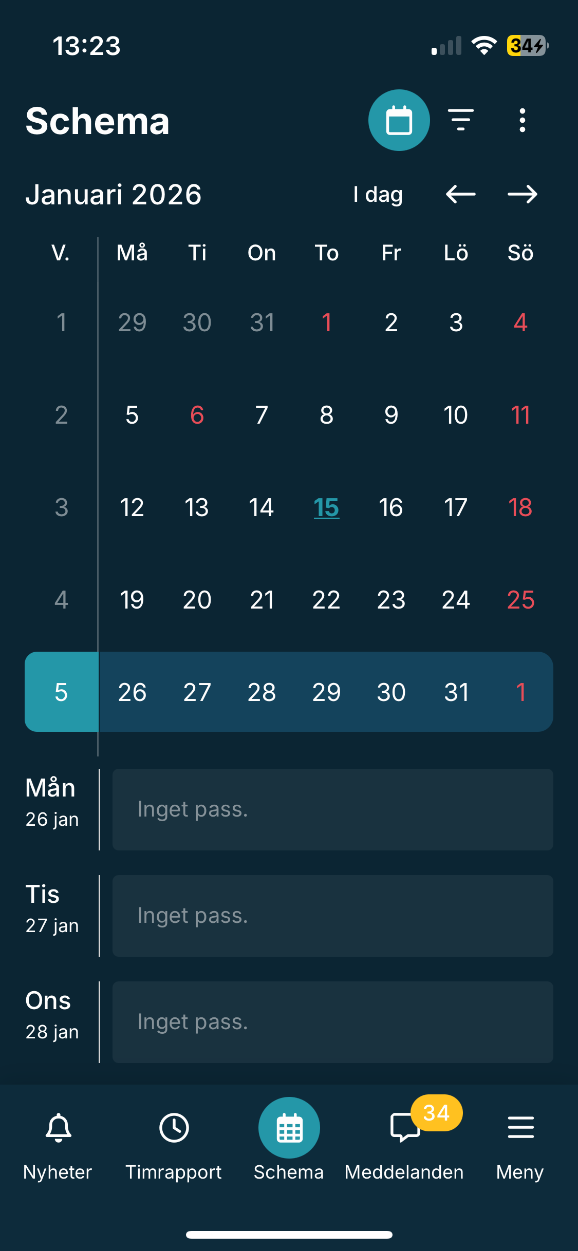
The existing schedule view is strong in some ways:
Weekly overviews are clear at a glance
Monthly view is accessible
Basic confirmation exists after marking availability
Analysis & Insights
Key insight
Users don’t just need a schedule—they need a clear, reliable path to act on it.
But these positives are overshadowed by unclear navigation and inconsistent feedback, which increases cognitive load and leads to user anxiety.

How Might We?
How might we make it intuitive for employees to navigate and manage their schedule, while giving clear feedback that builds confidence in their actions?
Design Goals
Clarify navigation so key actions are obvious at a glance
Reduce cognitive load with clear hierarchy and labels
Provide unambiguous feedback for every action
Connect availability updates directly to the schedule
Variant 1
Dropdown Navigation
Key actions (Availability, Search Shifts, Export Schedule) are grouped in a dropdown menu
Focus keeps the schedule as the main visual element
Availability flow split into clear steps: choose availability → select dates → receive confirmation
Confirmation and error messages appear on a dedicated page, with clear instructions for fixing mistakes
Why it works?
Functions are self-explanatory, actions are fast, and users never lose context of their schedule.
Low-Fidelity Prototypes
Why it works?
Reduces visual clutter, emphasizes schedule first, and guides users step by step.
Variant 2
Visible Functions & Combined View
All key functions are visible immediately, no dropdowns
Weekly schedule and calendar combined in a single scrollable view
Feedback appears as a snackbar on the same page—confirmation or error is immediate
Maintains connection between schedule and actions
Reflection
I focused on the schedule and availability flow because these are the points where the current app generates confusion, hesitation, and errors. By simplifying navigation and providing clear, actionable feedback, these prototypes aim to transform the experience from “I hope this worked” to “I know exactly what happened.”
Low-fidelity prototyping was ideal at this stage—focusing on structure and clarity over visual polish allowed me to address core usability issues before diving into design.
Next Steps
Conduct user testing to compare the two variants
Refine the flow based on feedback
Transition to mid-fidelity prototypes with a focus on hierarchy and microinteractions