
Backpacking
Backpackers don’t always book accommodation calmly at a desk. Usually they tend to book it late, on the move, with low battery and even lower patience.
This project explores how a mobile-first booking experience can be designed for speed, simplicity, and spontaneous decisions.

The Problem
For backpackers aged 20–30, price matters and time is limited. Every extra step is friction. Me and my two other friends framed the challenge as:
How might we help backpackers quickly find affordable accommodation — without slowing them down?
Below is the documentation of the project, and you can also check out the Figma file if you
Ideation & Concept Development
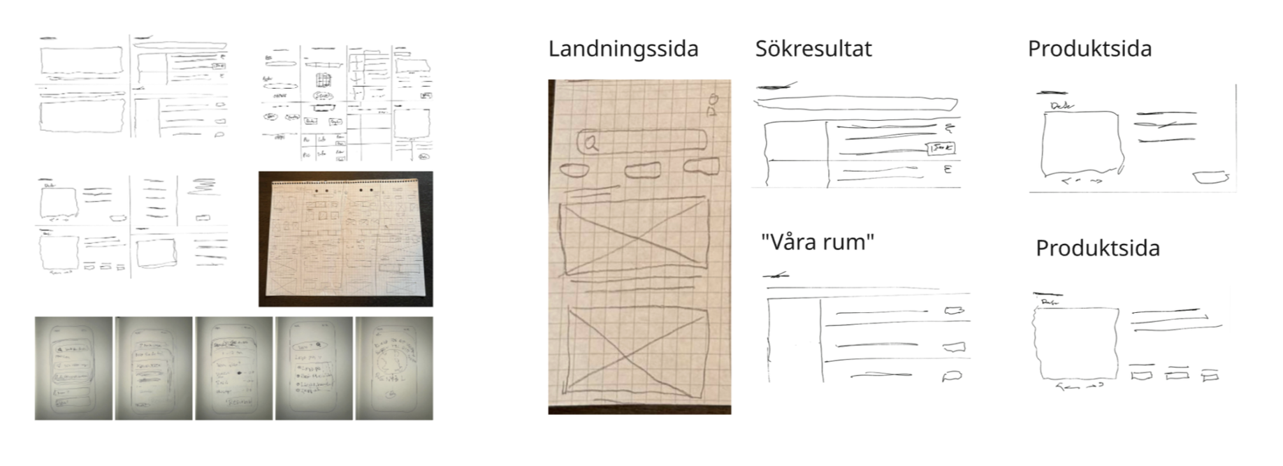
To explore a wide range of possible solutions early on, we worked individually with Crazy 8’s, rapidly sketching different ideas for layout, navigation, and booking interactions.
This phase allowed us to think broadly before committing to a single direction. When we regrouped, we compared concepts and selected the ideas that best supported speed, clarity, and mobile usability.
These sketches became the foundation for the structure of the final flow.
Structuring the Experience
We mapped the full user journey from first landing to completed booking to identify the most critical steps. The selected ideas from the ideation phase were then combined into a low-fidelity prototype in Figma, with focus on flow rather than visual detail.
Low-Fidelity Testing: Key Insights
We tested the low-fi prototype by asking users to find a room and complete a booking. The goal was to identify friction, unclear steps, and unmet expectations early on.
Key outcomes from testing included:
Users expected the booking to start directly on the start page
Extra steps in the flow felt unnecessary and slowed momentum
A final confirmation step increased trust before completing the booking
Room descriptions worked better when short and scannable
Design Iterations
Based on testing, we refined the structure and flow by:
Moving booking functionality to the start page
Simplifying room information
Adding a confirmation step before completing the booking
Each iteration aimed to reduce friction while maintaining clarity and confidence.
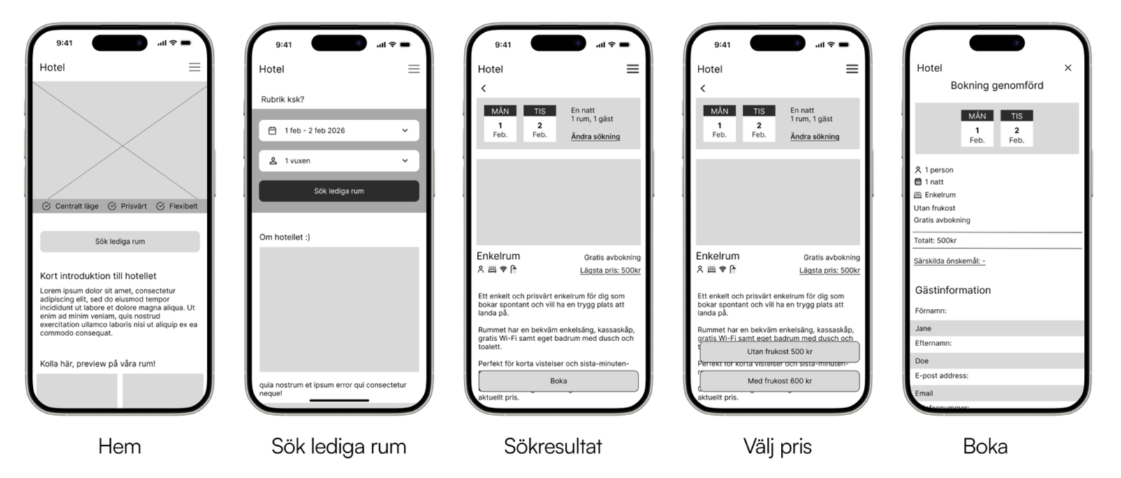
High-Fidelity Prototype
The final design was translated into a high-fidelity prototype, focusing on visual clarity, hierarchy, and interaction details.
The hi-fi prototype demonstrates how the final booking flow works in practice, from landing on the start page to completed booking.
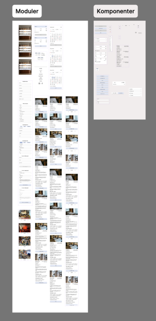
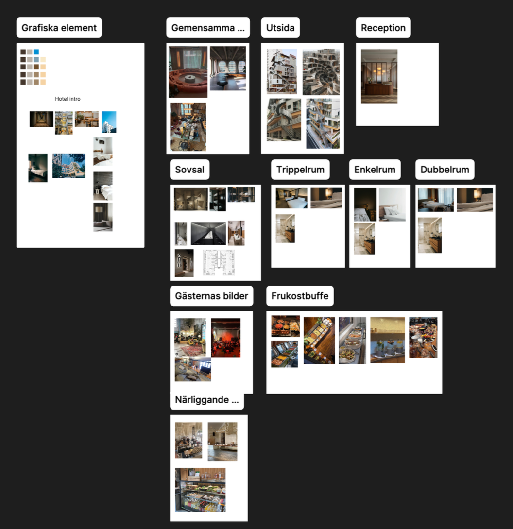
Design Process in Figma
To ensure consistency and scalability, we worked systematically in Figma using components, auto layout, and modular design principles.
Key aspects of the process:
Reusable components for navigation, room cards, buttons, and form elements
Auto layout to maintain consistent spacing and responsive behaviour
Modular layouts that allowed us to iterate quickly without breaking the structure
This approach made collaboration smoother and enabled faster iteration from low-fi to hi-fi.
Outcome
The final prototype delivers a fast, mobile-first booking experience designed for travellers on the move.
The project highlights the value of early ideation, rapid testing, and structured design systems in creating intuitive user flows.
Next Steps
Conduct user testing to see what was and what wasn’t helpful
Refine the flow based on feedback