
WEbsite: Multilingual Communication
Clients want to express who they are and what they can offer.
Users want to know how to clearly understand that.
This project focuses on turning a professional vision into a clear navigation system — preserving the client’s voice while removing effort for the user.
Above is the latest hi-fi prototype and you can check out the Figma file by
Project Overview
A personal website designed in close collaboration with a client who had a clear identity but struggled to express it in a way new visitors immediately understood.
The project focused on translating her tone and intentions into a structure that feels obvious to someone encountering her platform for the first time.
My Role
• Client workshops & interpretation of tone
• Information architecture & UX structure
• Wireframing and prototyping (Figma)
• Design system creation (components & styles)
• User testing and iteration
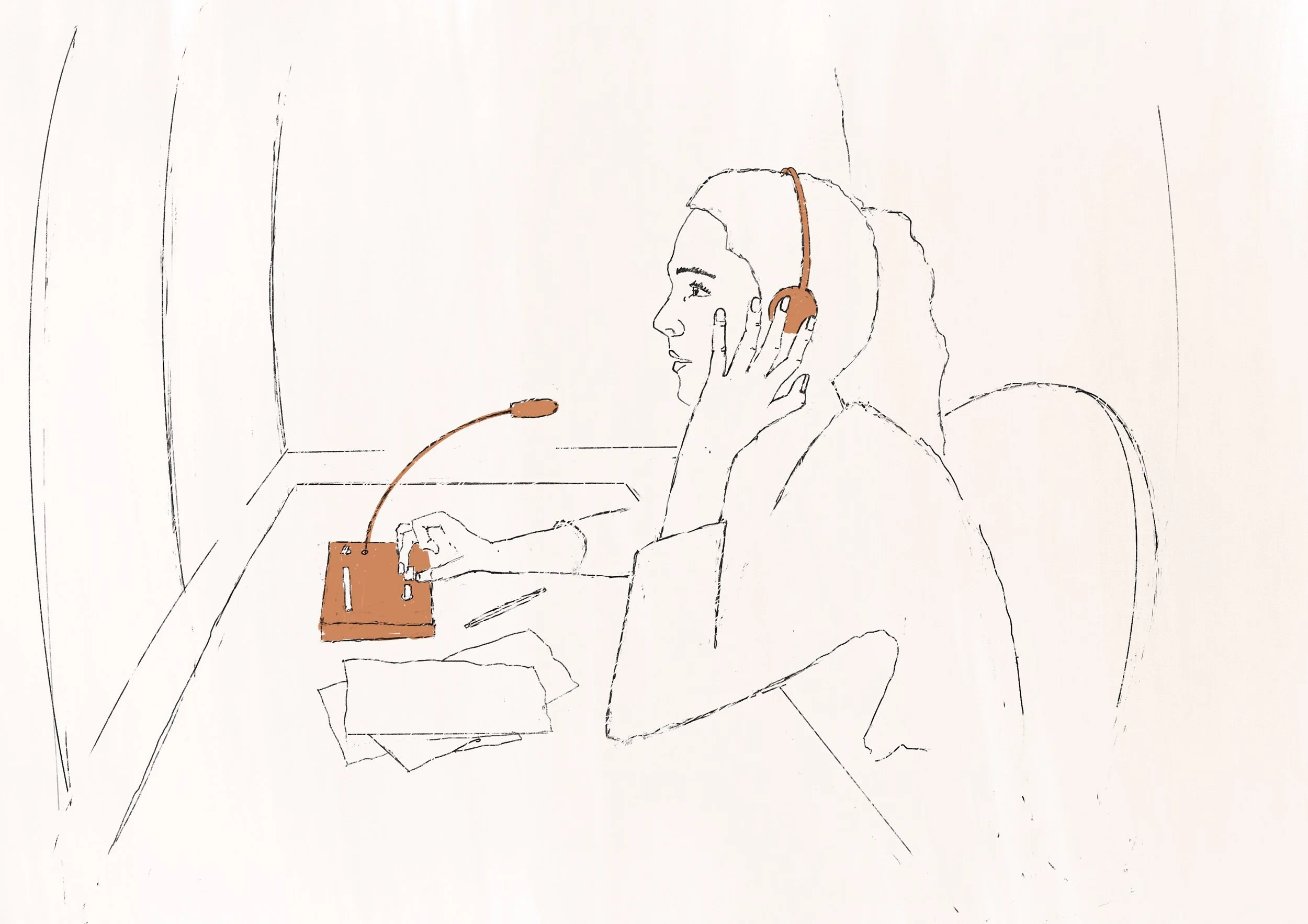
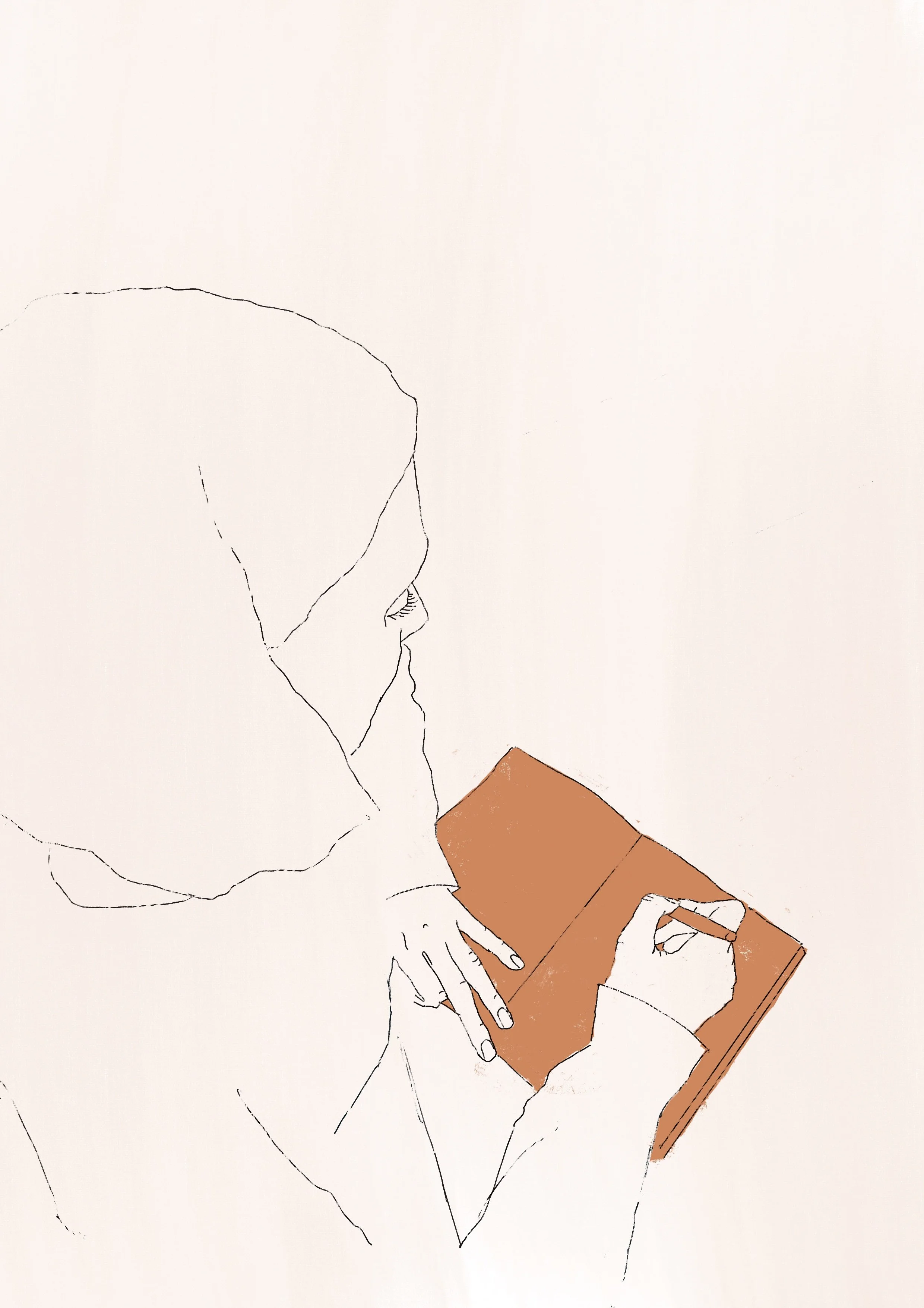
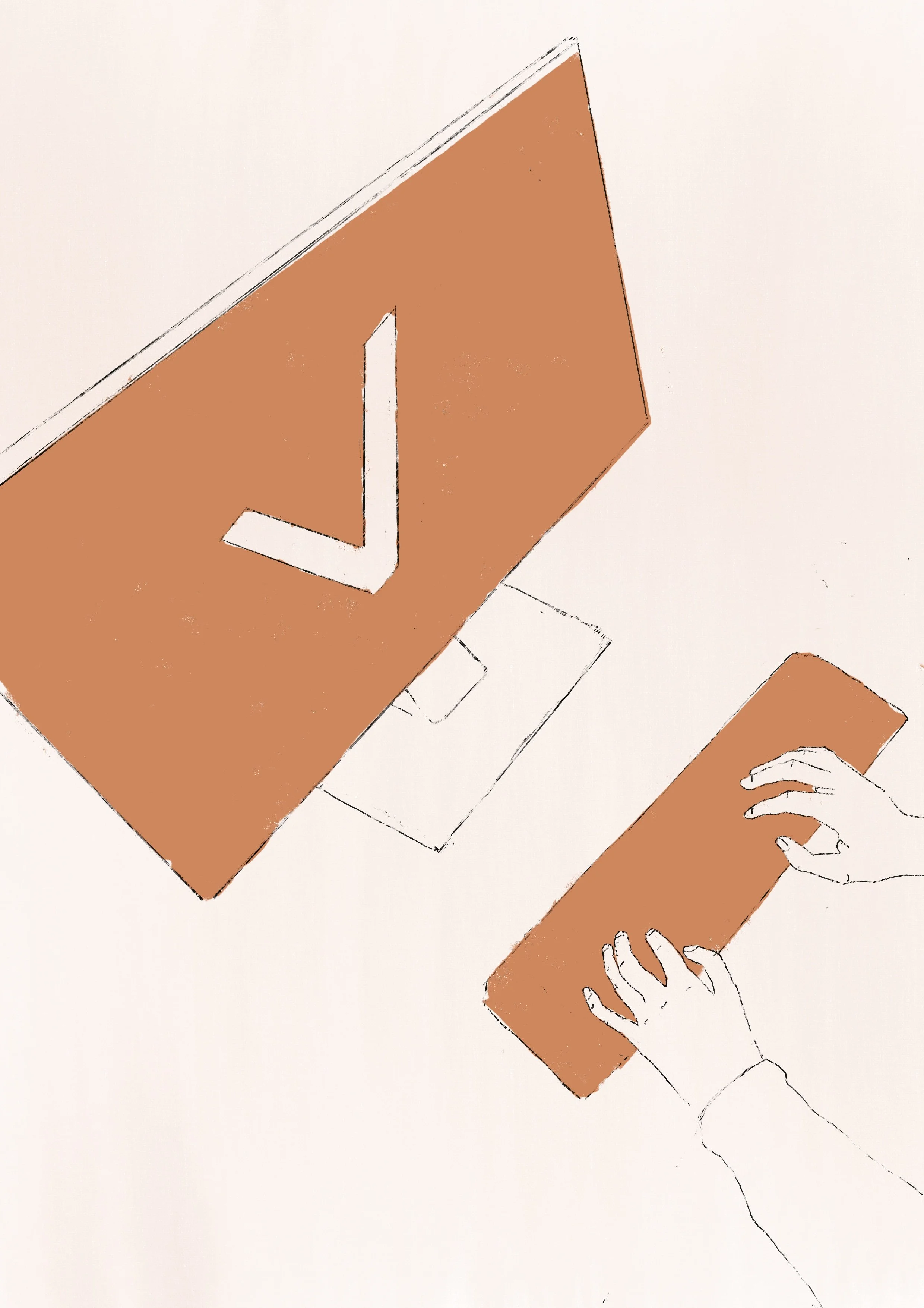
• Custom illustrations supporting navigation and mood
The Challenge
The client described a vision — users needed direction
The goal became preserving personality while removing cognitive effort.
Approach
I began with sketching out an IA, site map, user flow and low-fidelity wireframes which focused purely on hierarchy and flow.
By stripping away visual styling, we could evaluate whether the structure itself communicated the right story.
We tested those and had to make some adjustments based on the feedback.
What followed were the first two hi-fi prototypes, acting as conversation tools between the client’s intention and the user’s interpretation.
first Draft Hi-Fi prototype
Desktop version
Mobile version
What We Learned
User testing revealed that visitors were more interested in understanding the person behind the website than in exploring its content. When gaining that understanding required effort, users often stopped navigating.
To address this, we simplified choices, clarified the purpose of each section, and created a clearer progression through the site, while emphasizing a stronger personal voice for the translator.
The testing highlighted that visitors were particularly drawn to her personality and tone as a translator, rather than the site's hierarchy or navigation. This insight led me to focus on giving the website a more personal, less generic feel, which included sourcing alternative images and creating custom illustrations to better reflect her character.
Iteration
The current version is a rebuilt system rather than a refinement.
I created reusable components and layout rules in Figma to maintain consistency, and added custom illustrations that function as orientation cues — helping users sense where they are and what kind of content they are entering.
The interface now communicates character while guiding behaviour.
Next Steps
• Conduct additional user testing on the iterated version to validate navigation clarity
• Design and refine the mobile experience
• Implement the final website in development
The goal is to ensure the structure works across contexts before the visual and technical details are finalized.
Project Details
Timeframe
4 weeks (ongoing development)
Role
UX/UI Designer — research, structure, prototyping, visual language & illustration
Tools
Figma · Miro · Procreate · Google Docs